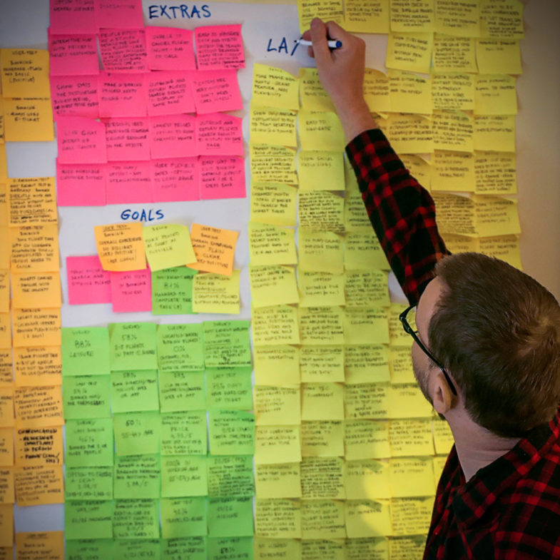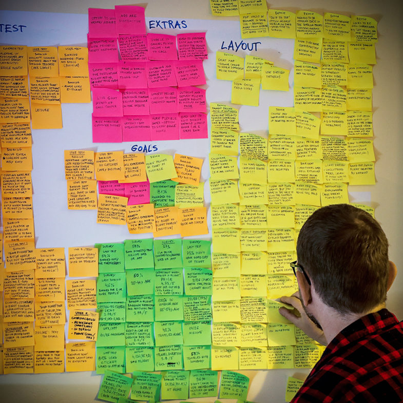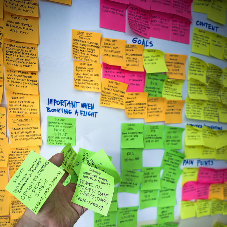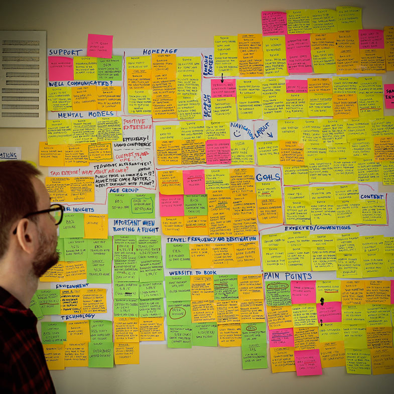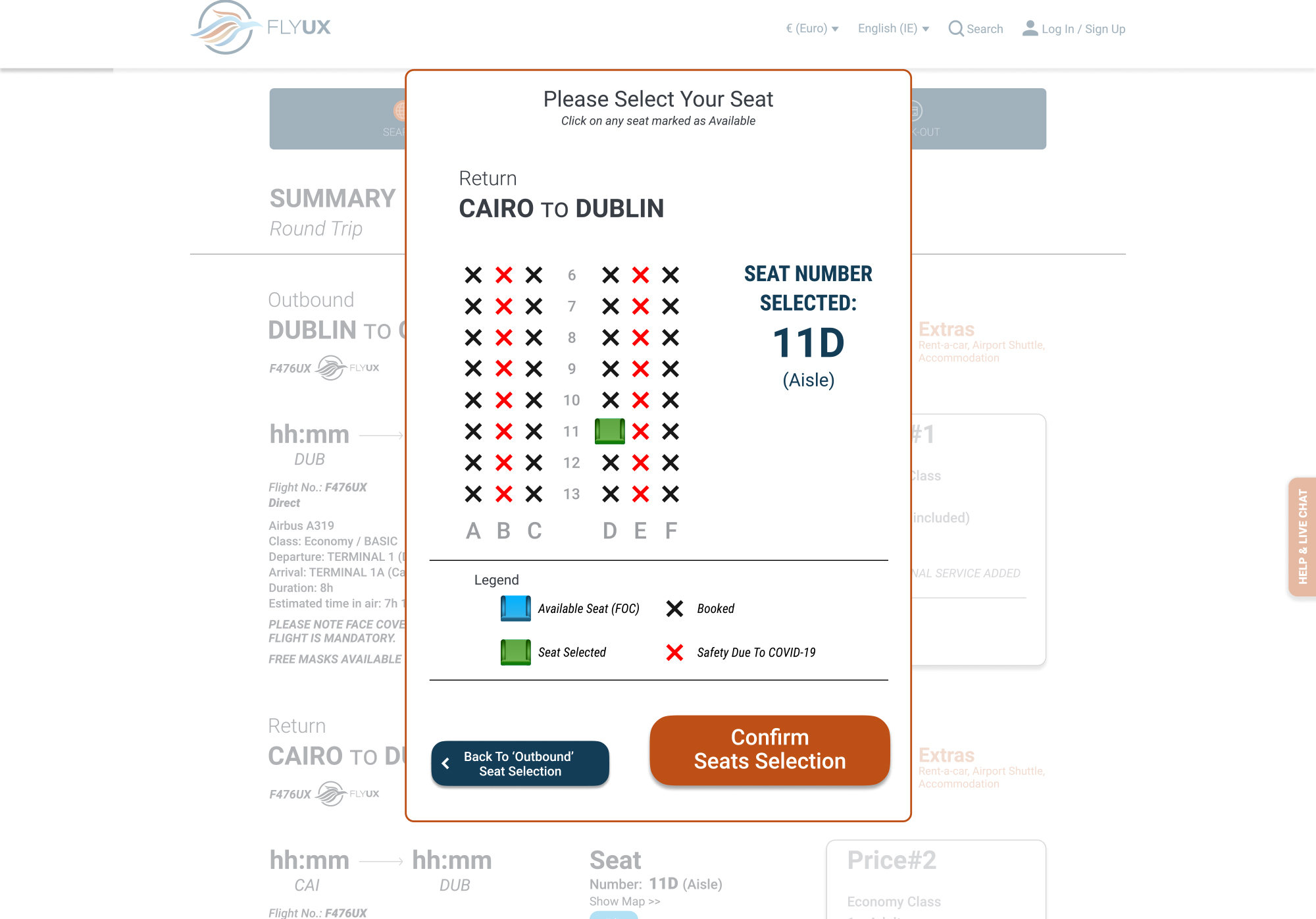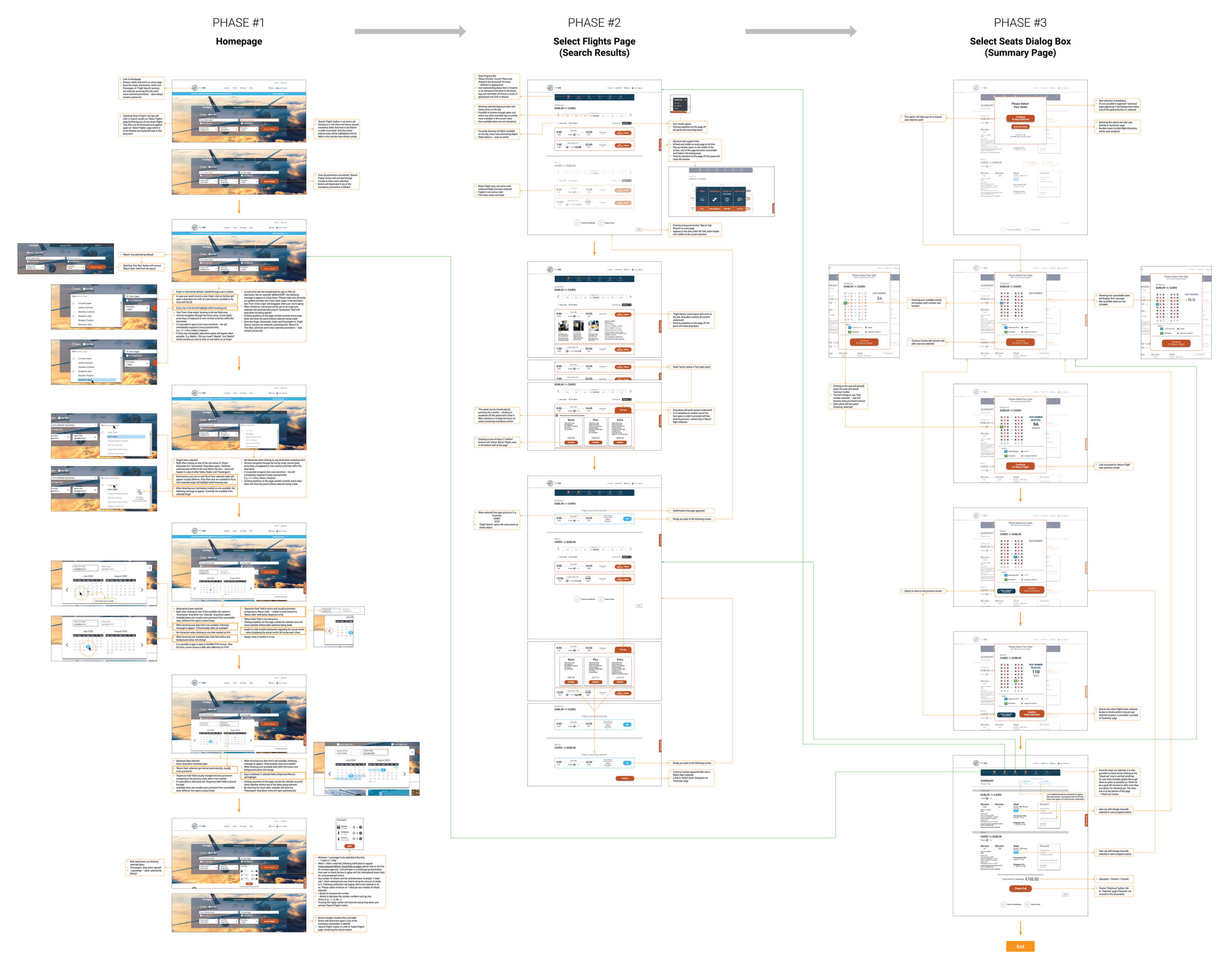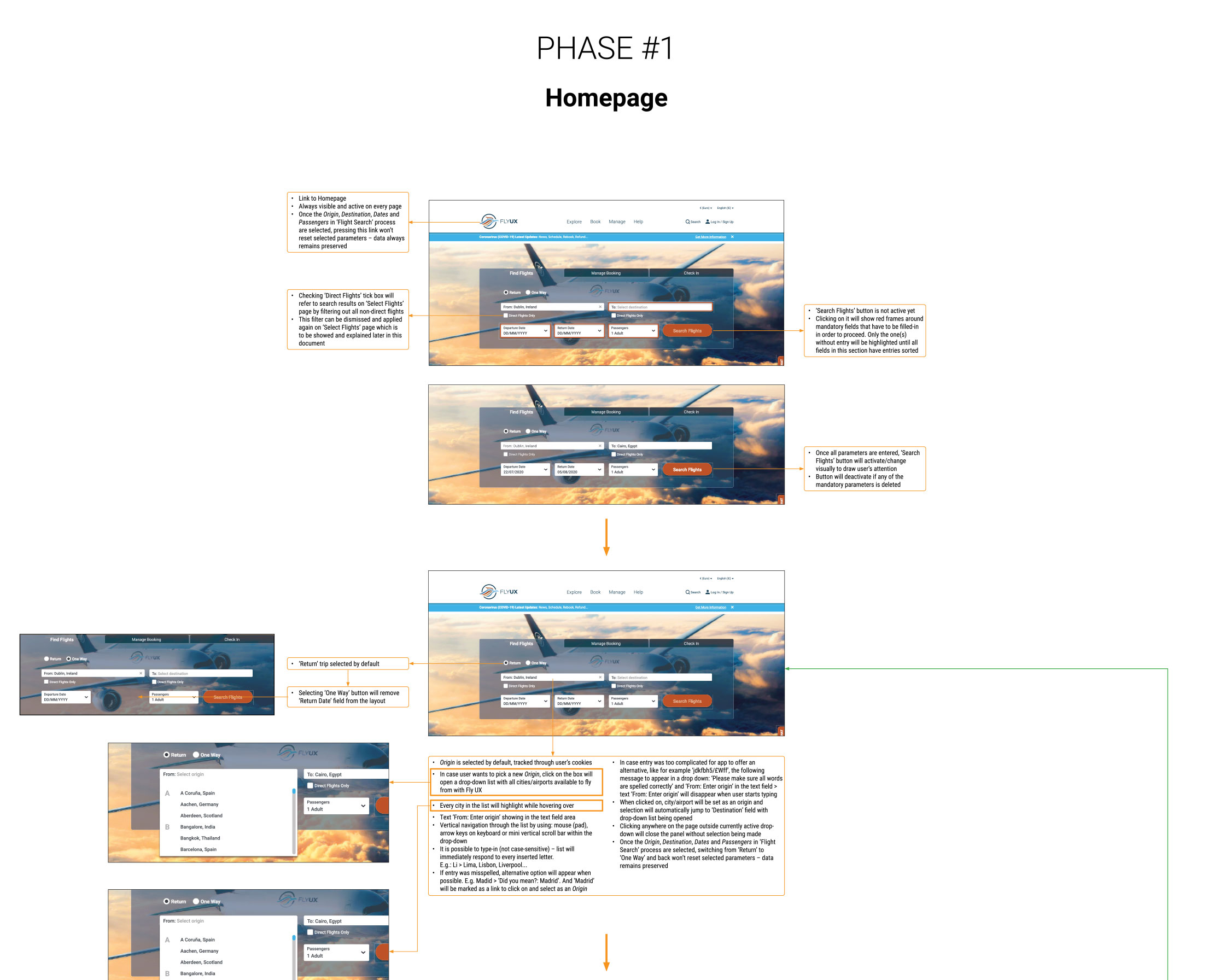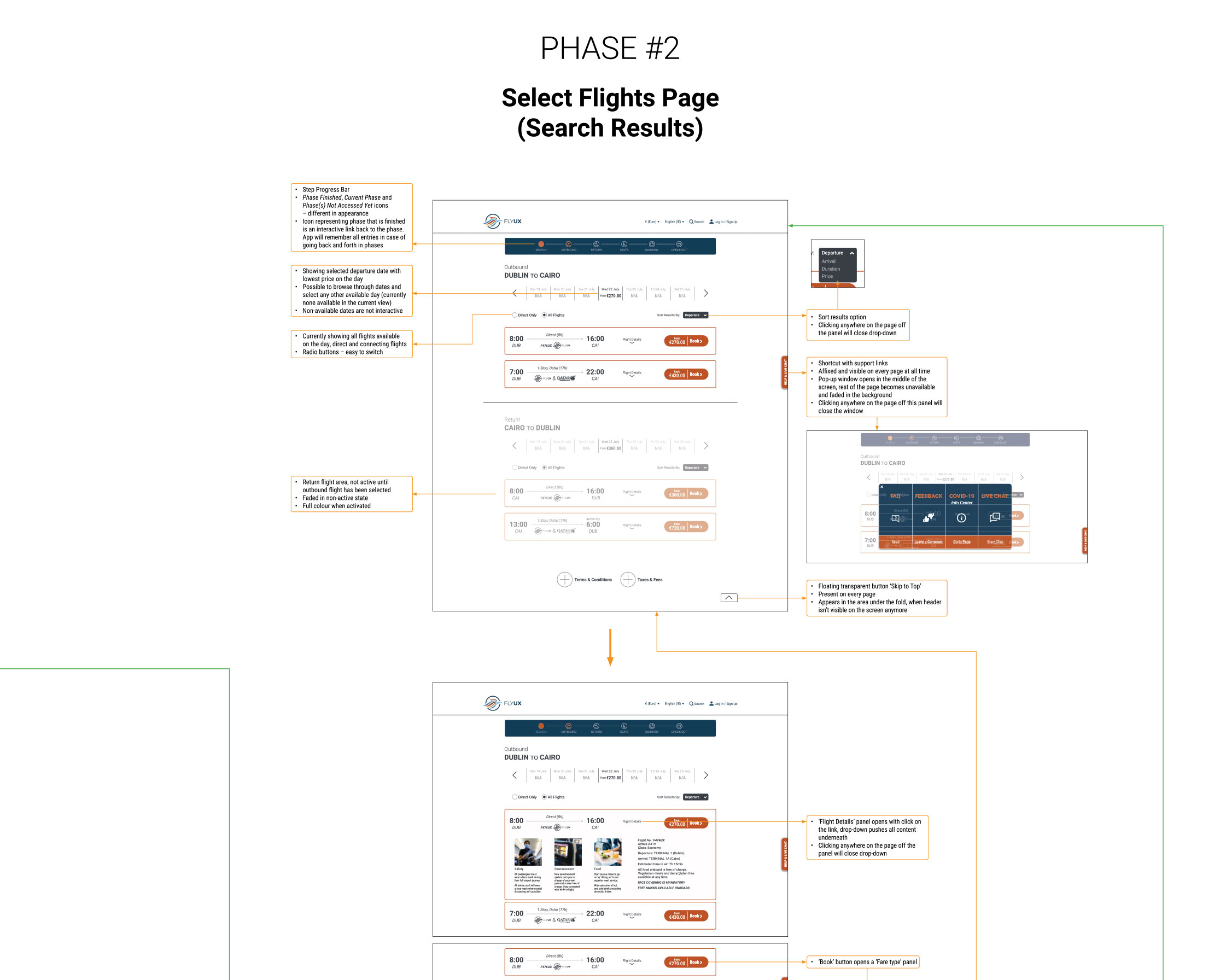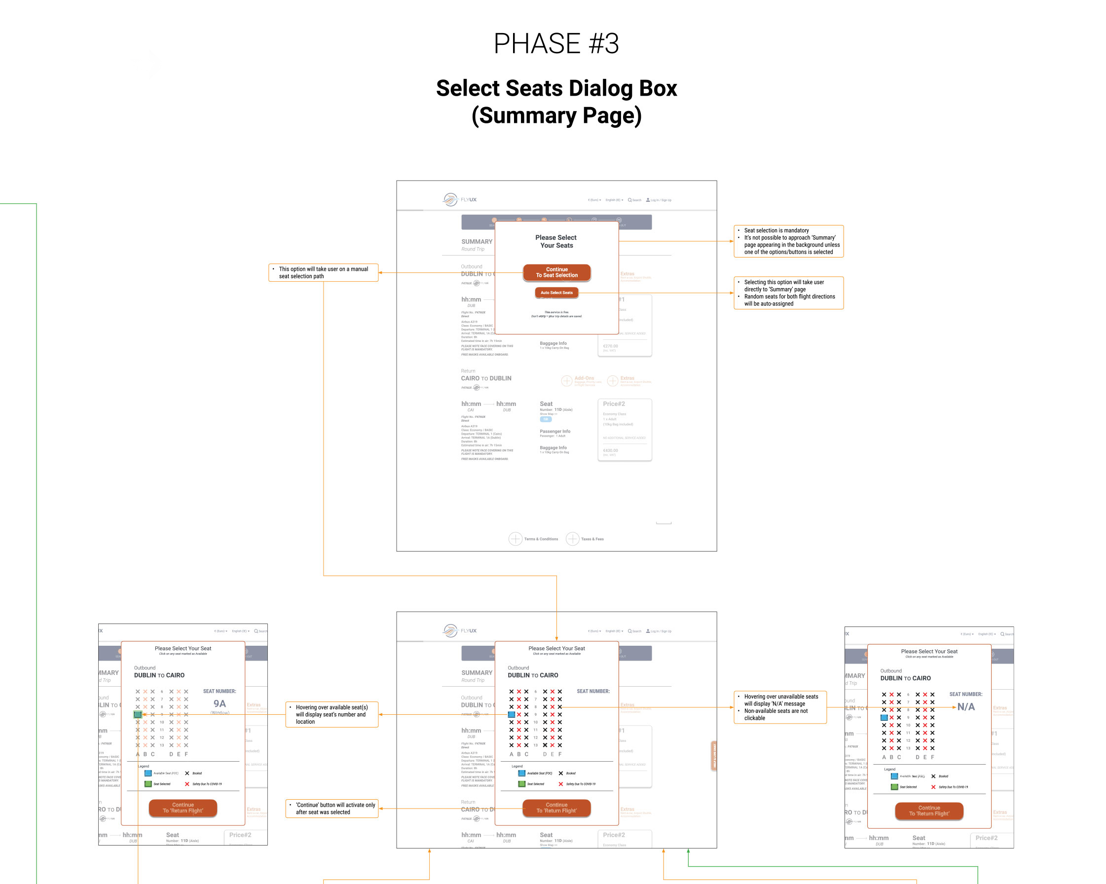
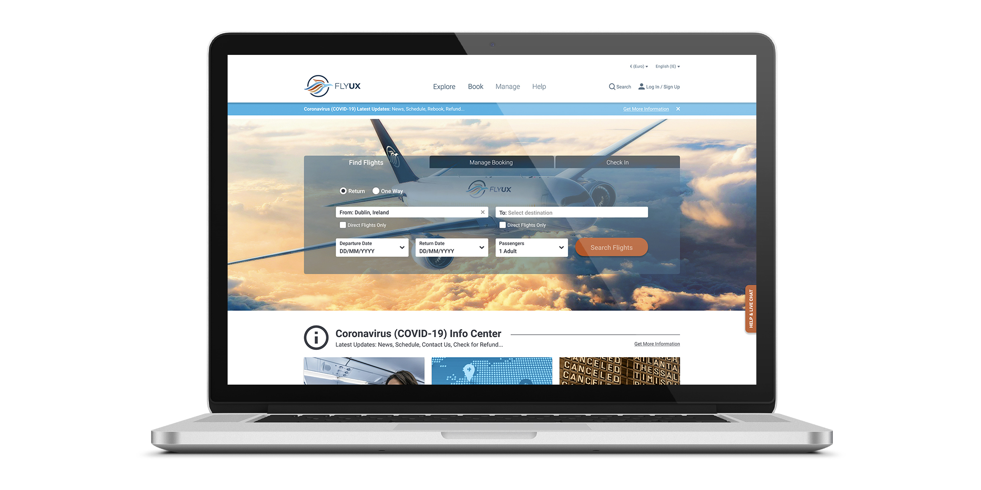
Client: Fly UX is a startup airline company preparing to make a significant success in the world market. Finding users’ satisfaction-factor very important, they look to ensure a stress-free experience within the booking process.
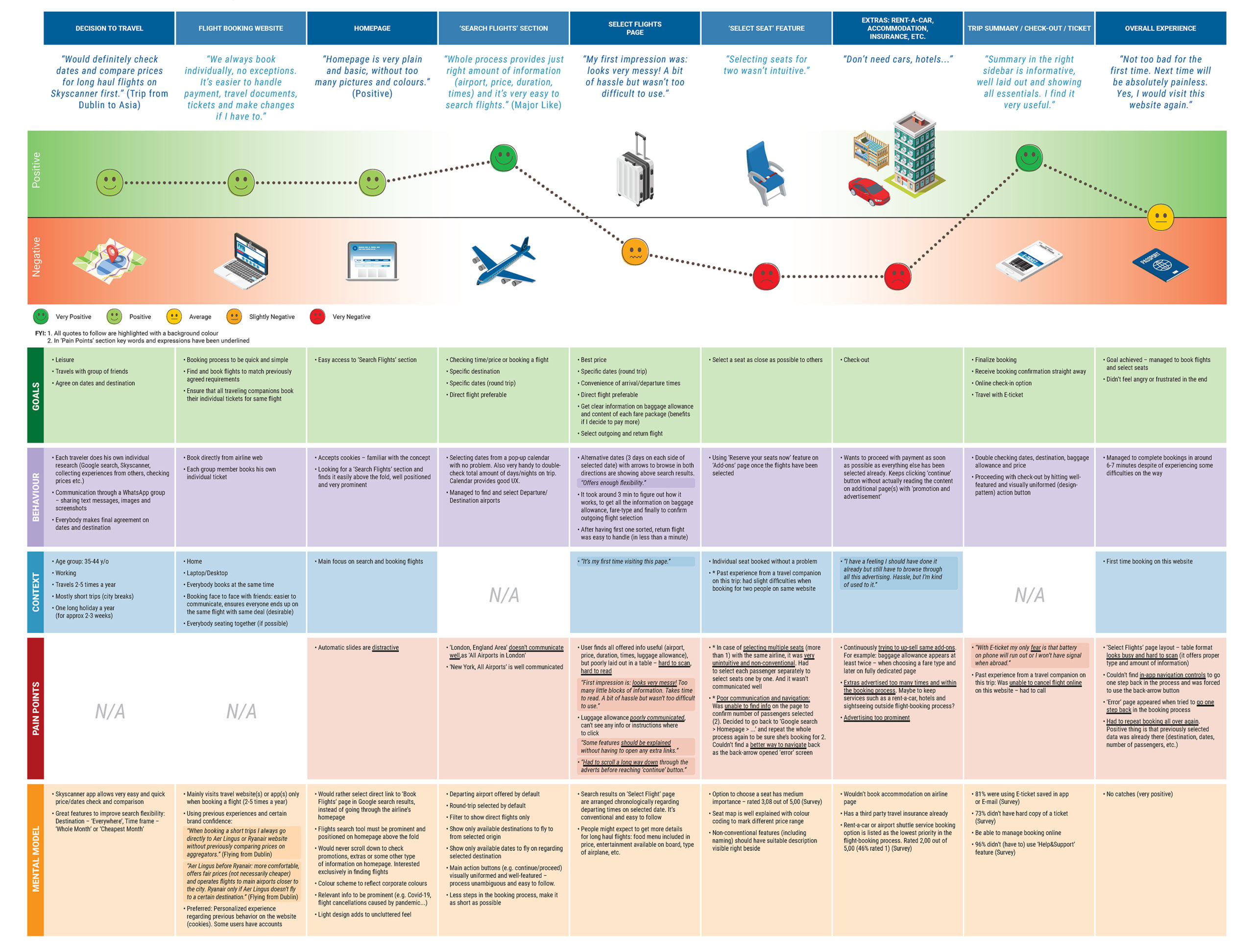
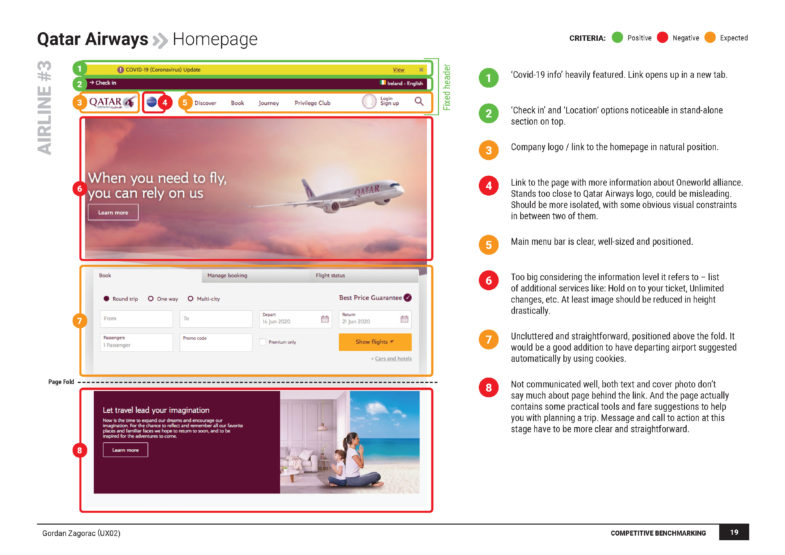
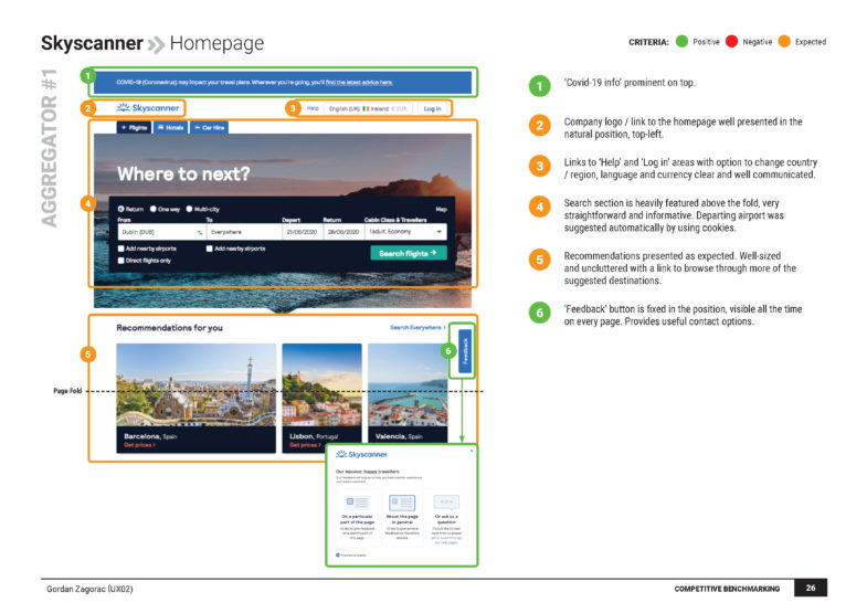
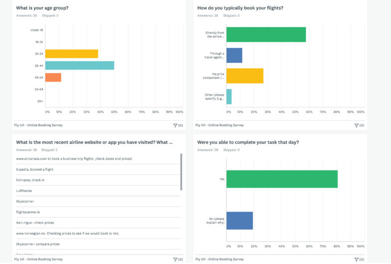
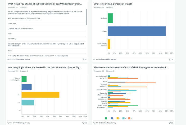
Objectives: Gathering information about competitors (Ryanair, Aer Lingus, Qatar Airways, Skyscanner), collecting structured and unstructured data, learning about users goals, context, behaviours
Objectives: Understand research insights and articulate the problems in both flights search and booking process through collected data analyses
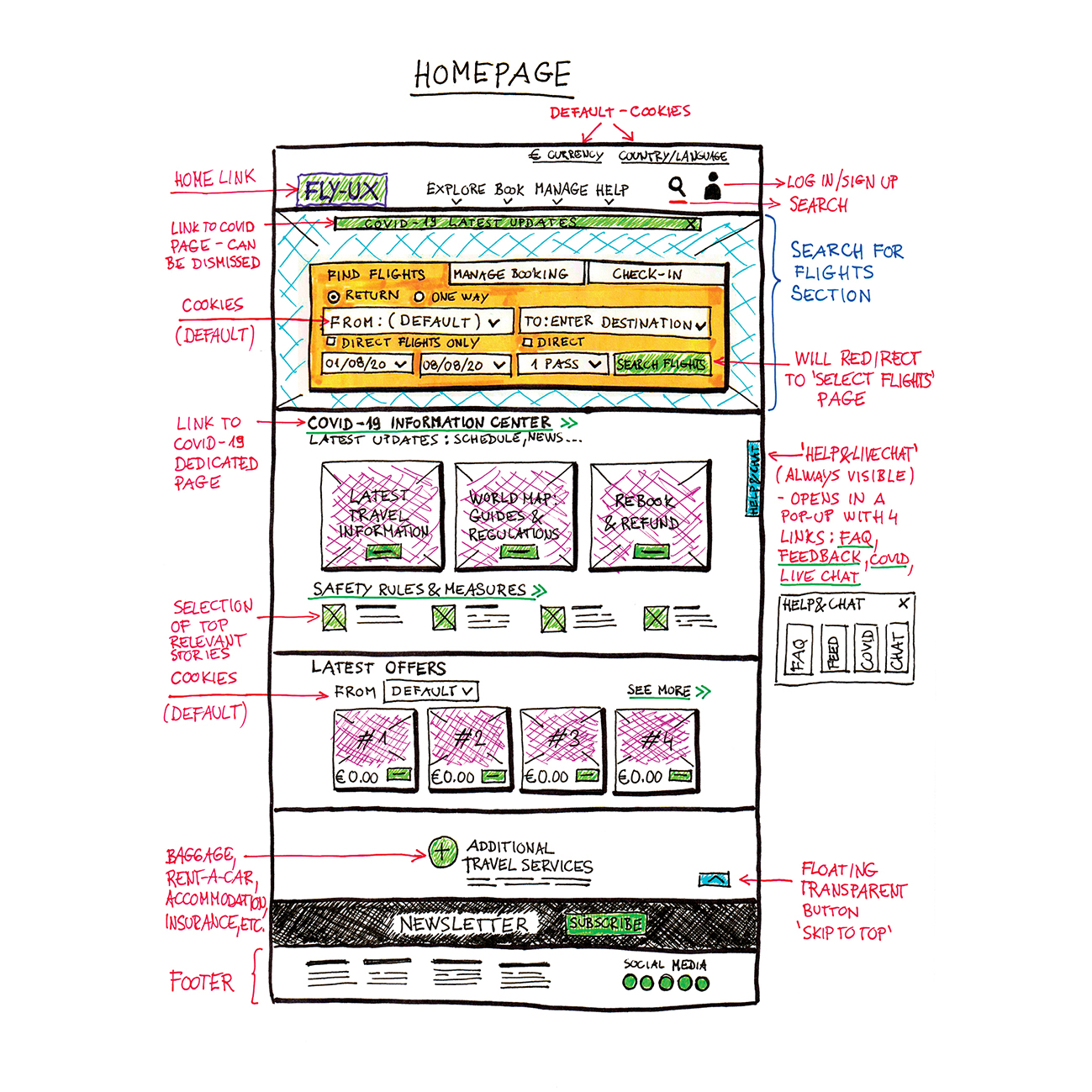
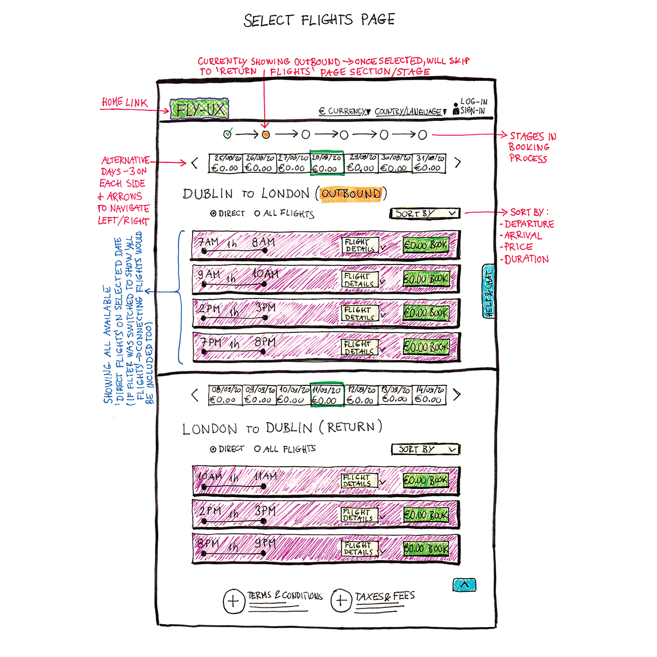
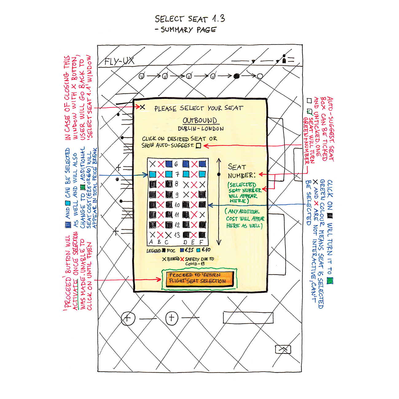
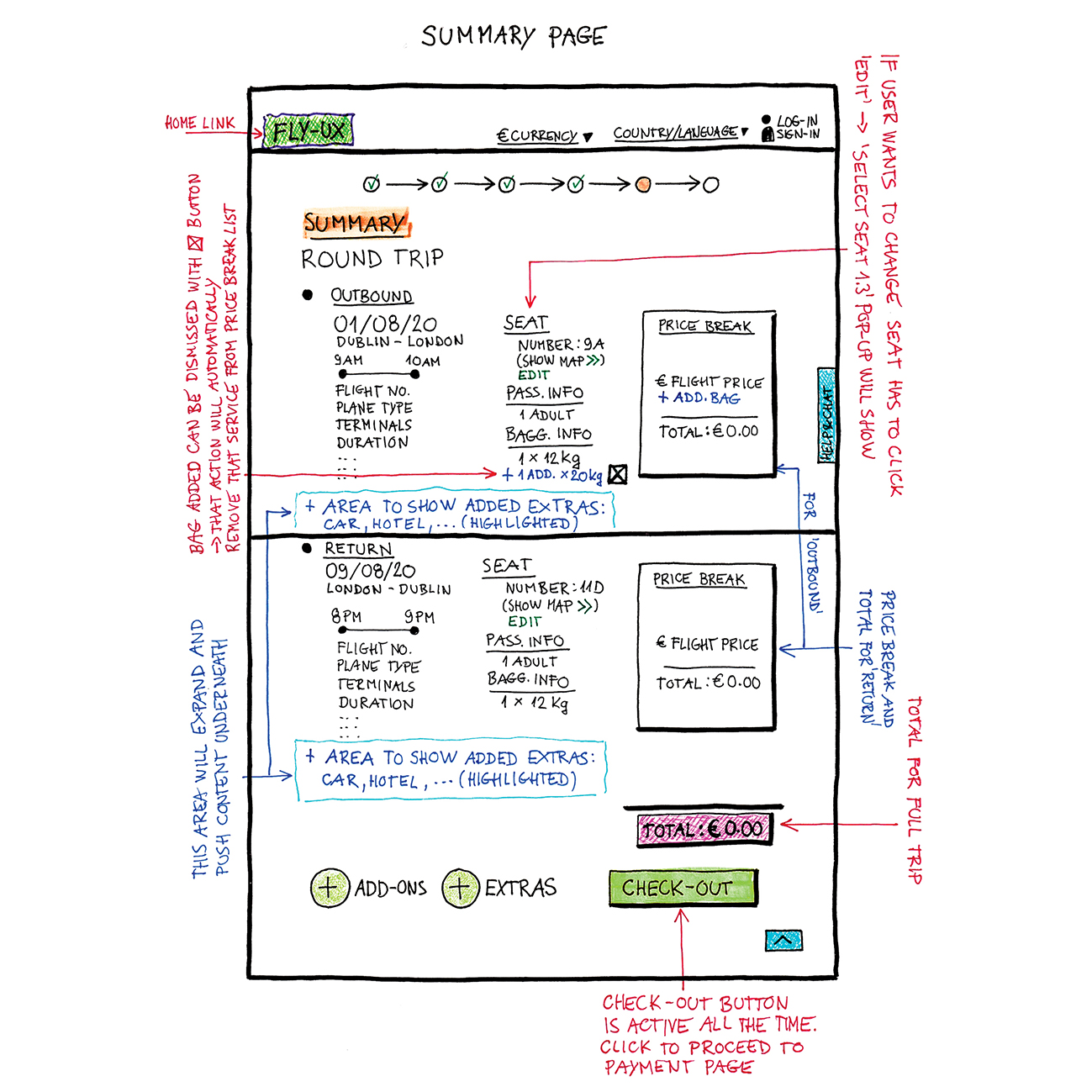
Objectives: Sketching screens and screen states, creating information architecture, defining interactions, navigation and high level flow for primary use case
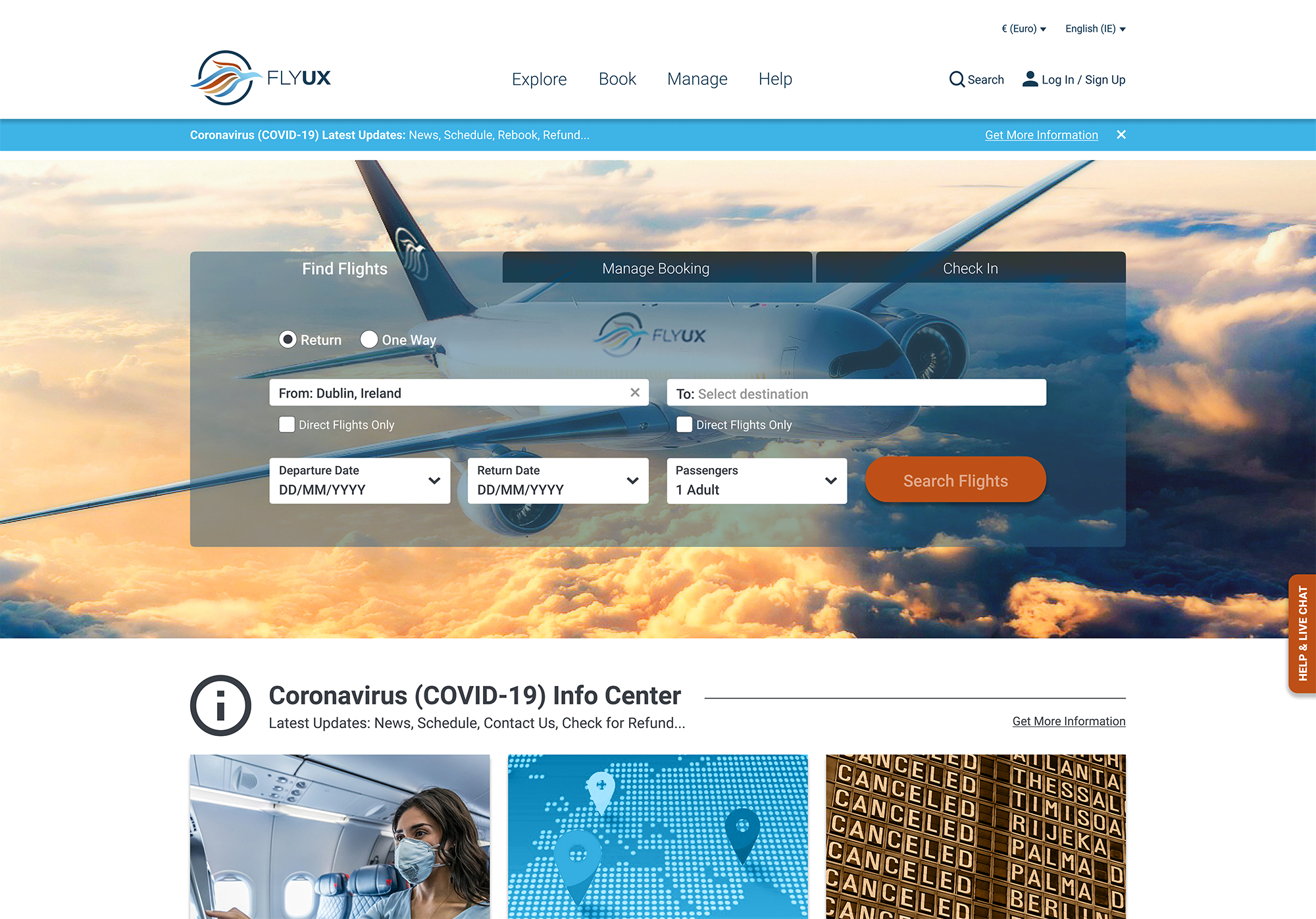
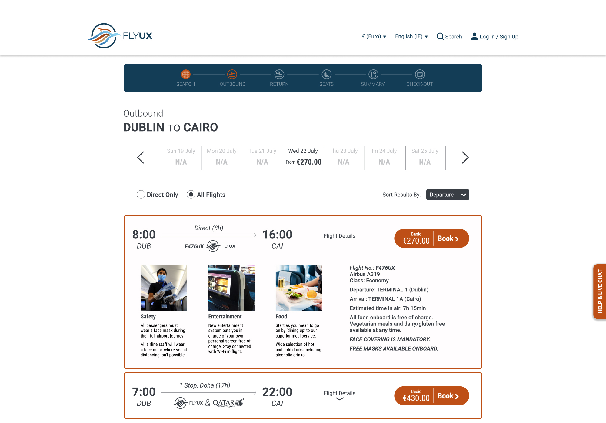
Objectives: Build a high-fidelity prototype and compile wireframe documentation on future Fly UX desktop app
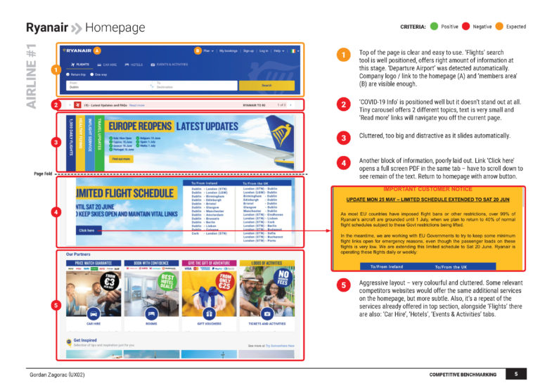


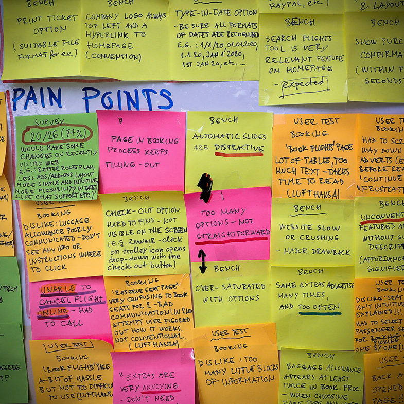
I find this hard to read. There are too many little blocks of information.
Kasia
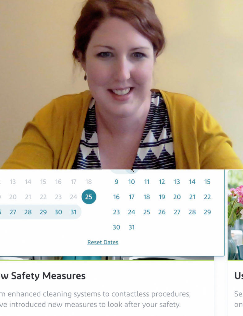
When traveling with friends, we would first agree on the date and flight and then all book independently because it’s easier. That works best.
Carmel

‘London England Area’ doesn’t communicate well as ‘London, All Airports’
Andrea
